We are pleased with this write-up in the Princeton Living section of the Times of Trenton, March 5, 2020.



We are pleased with this write-up in the Princeton Living section of the Times of Trenton, March 5, 2020.

So, you’re ready for a kitchen upgrade starting with fresh new paint. Great!
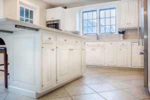
Whatever mood you desire to create — crisp, comfy, sleek, or retro — neutrals are “in,” and white is a versatile and popular choice. (Please enjoy our pics from recent Greenleaf projects!)
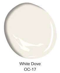
Shades of white provide a perfect setting for a kitchen space, accommodating all other colors and the full gamut of materials and textures.
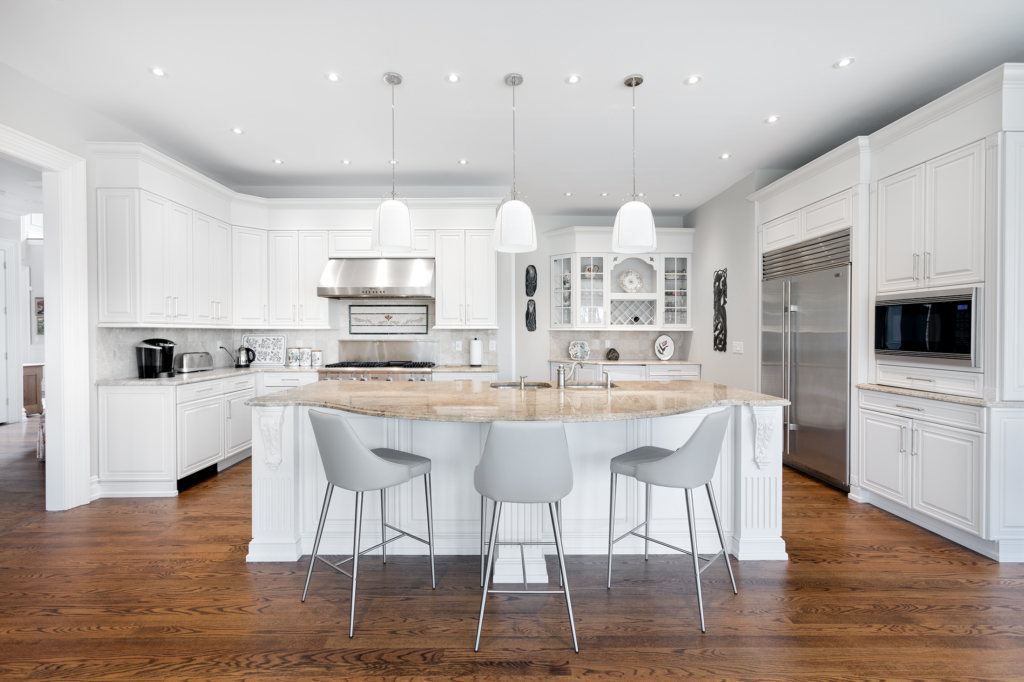
Here are five style choices for integrating a white kitchen with accents and furnishing to create the just-right ambience you desire.
Clean and crisp: Make use of contrast with stainless steel or black appliances and accessories or glass surfaces. Add finishing touches with a few brightly colored accents like chair covers, vases, sculpture, and vibrantly colored flowers.

Warm and comfy: Wood is your friend. Consider using dark or light wood flooring and furnishings (as above) plus wall accents like decorative wood utensils. White-on-white paper on one wall can add softness and interest, and a vase of pastel or warmly colored flowers can add a welcoming touch.
Modern and sleek: Integrate contemporary furnishings with architectural lighting (beautiful pendant lighting below!) Add finishing touches with abstract sculpture, art and photography.
Retro and relaxed: Past and present can be happy together with appliances and flooring patterns designed with an old-school look. White walls are the perfect canvas for black and white photos and old movie posters. Finishing touches can be discovered at antique shops and yard sales.
Eclectic: You might prefer a blend of styles … We paint a lot of historic homes (these cabinets, below, used to be cherry!) We often see wonderful blends of the old and new. Be creative — it’s your kitchen!

Whatever style you choose, add freshness and seasonal color with plants, flowers, and fruit bowls. Create interest with recessed lighting and unique or classic pendant lighting. Add pops of color with artwork, and decor.
White walls blend well with a variety of back splashes and kitchen islands. Backsplashes popular with many designers include marble, hexagon patterns, nickel or mosaic tile, and brightly colored block patterns. Prep and serving kitchen islands come in several woods and colors with countertops that include granite, marble, quartz, wood or hybrids.
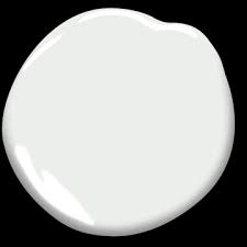
Some popular whites are Decorators White (above) and White Dove (top of page) from Benjamin Moore or Snowbound and Alabaster (below) from Sherwin-Williams.
White has been a go-to kitchen color throughout modern history and has become especially popular this season. It’s often the choice of both designers and homeowners who want a color that looks and feels fresh and blends well with countless elements.

Call us soon — Greenleaf is now scheduling for the outdoor season (continuing indoor work as usual, too!). And thank you for sharing our name with your friends and family. Your word of mouth and online reviews make a huge difference to a small company like ours!
Our latest news update: You can now watch our educational videos on YouTube. The latest is “Why We Go Green.” Get videos, more updates & pics on Facebook& Instagram! These include our crew and leadership highlights, fairs we attend & other news. “Stop over” on one of these platforms and say hi!

Color can affect your mood, and how you use color in your home can shape how cozy your living space feels. Use these tips for lassoing the colors that please you to create a cozier, happier home.
The colors for 2019 are relaxing shades of lilac, rose, peach, leafy green and daisy yellow. Do any of those colors call to you? Here are tips for how to easily play with these or other colors you love:

Tip #1: Go for pleasing accents
Switch out your throw pillows, stack a few indoor gardening books. A sheep skin, pastel throw or lightly-patterned area rug can give a room a new, soothing look.
Nature is associated with relaxation. Bring some of it indoors with you! We always love coming home with a small potted flower from the local greenhouse. Avoiding pollen? A set of empty vases can work wonders with color.
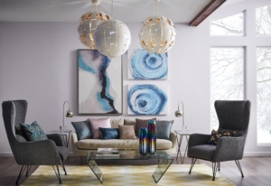
Tip #2: What colors make you feel happy?
Identify your personal favorite “happy colors” and splash them around using tip #1. This round-up of suggestions is gathered from Southern Living Magazine:
Blue and green are associated with peaceful feelings. Lighter shades of blue and pastel greens are trending — they are especially nice for offices, libraries or bedrooms.
Orange. This warm and energizing color is great for entry ways, accent walls, a child’s room or kitchens. Why not try a softer shade that leans toward peach?
Yellow is often thought of as a sunny color — for obvious reasons — bringing optimism. This energetic color is also great for kitchens or a child’s room.
White makes small rooms look more open. It’s a clean-feeling color, and white kitchens are very “in” right now. If white is too stark for you, try a light shade of gray or cream.
Tip #3: Trends come and go, so make it your own
Play with color and have fun! Ask a friend whose home you admire to come and “play” with you!If you need design assistance, we recommend these designers who we have had the pleasure of working with over the years: Linda Principe Interiors, Linda Madani Interiors and Ellen Maranca, of EZM Interiors.
And finally, if you want to re-paint some room colors, or do a full interior, this is the time to get on our schedule! We paint through the holiday season and all year round. We’d love to come and talk color with you.
