Choosing Interior Colors? Read This Advice from Designer Ellen Maranca

Are you choosing new interior colors? Read our Q&A for some pro tips from interior designer Ellen Maranca of EZM Interiors, Lambertville, NJ! Ms. Maranca’s designs are showcased in the accompanying photos, which includes painting by our team at Greenleaf Painters!

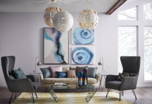
Home office painted in a light blue by Greenleaf Painters

What do you like most about your design work?
What I like best about being an interior designer is working with different people. Each person comes to the table with interesting ideas, lifestyles, needs and desires. My job is to mesh all the family members’ wants in a cohesive and interesting way. It’s a puzzle that needs to fit together.

Choosing wall colors is a big decision. Any tips for choosing wall color to go with existing furniture and flooring?
Wall colors change dramatically in a space from day to night and with different colors that surround them. It’s one of the most challenging pieces in my business to get it right. It takes time and energy to “see” each color in the environment. Looking at painting samples is a must.

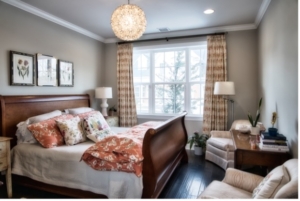
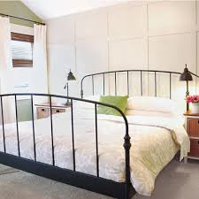
Greenleaf painted this bedroom in a soothing brown.

Accent walls are becoming popular. What are your thoughts on these?
Accent walls should be the focal point of the room.

What interior wall colors do you find popular right now in our area for living rooms, dining rooms and kitchens?
Popular wall colors change depending on the location. Clients in Florida want “cool” colors, Northeast clients want “warmer” colors, but in general most clients want light muted colors.

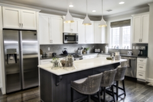
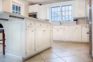
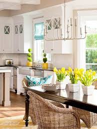
White cabinets paired with soothing earth colors make this kitchen inviting.

Do you have any favorite uses of color to share?
Paint is a game changer in so many ways. Example: my client purchased a home with a huge chandelier that they really disliked, wanted to replace BUT didn’t have the budget.

I convinced them to paint it a vibrant color. They LOVE this piece. We saved thousands of dollars; it’s a showstopper now.

Any other favorite design tips?
Advice: hire an interior designer; they save you money, explain where to spend, and where to cut back to get the home that reflects your unique personality and needs.

What got you into the interior design business?
Friends, wanting interior design advice after seeing my home. In the early part of my work career I was a display director for large department stores. Great training ground for spatial relationships.

To read more about Ellen Maranca’s work, please visit: www.EZM-Interiors.com.

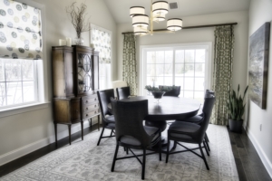
Dining room painted by Greenleaf

5 Reasons to Have Your Home Painted This Summer

Did you know that summer can be the best time for painting your house? Whether you’re looking to have your home’s interior painted, or you want to freshen up the exterior, late spring, summer and early fall are great times to do it.

If you’re interested in updating the color of your home, here’s 5 reasons to do it this summer from Greenleaf Painters!

Best Time to Fix Winter Wear & Tear

With the bright sun exposing areas of your home that were left shaded and hidden during the winter, it’s a chance to take notice of the wear and tear left over from the colder and wetter weather. This can include cracks, chips, peeling paint, and even wood rot.

Summer allows you to prioritize the much-needed upkeep and maintenance of your home alongside your painting project, allowing the contractors to focus their efforts to bring your home back to a pleasing aesthetic.

Increase Curb Appeal & Attention

Whether you simply want to update your home, or you’re planning on putting it on the market, having your home painting project completed in the summer is a great way to show it off to the neighbors and potential buyers. Since the weather is warmer, there’s more foot traffic that can admire the work outdoors. And if you entertain in summer, you’ll have a fresh look for those special gatherings.

Let Us Complete Your Project While You’re Vacationing

Did you know that can have the work done while you’re away on summer vacation? Our trustworthy crews have done this countless times for customers. While we work on your home, you can have your feet up elsewhere. How nice to return home and see the finished, new look!

Note: We also provide this service all year long for interior painting. Winter snowbirds and other vacationers enjoy being away while their home is being updated!

Using the Temperature to Your Advantage for Interiors

The warm weather provides some benefit when it comes to having the interior of your home painted. While we also think wintertime is a great time of year to paint (see our video about that), you might prefer summer, when you can throw open your windows. Even the lowest VOC paints can have a faint odor for a few days. So if you or a family member is extra sensitive to scents — or if you just like the feeling of open windows during and after a paint job — then late spring, summer and early autumn are your sweet spots!

What About Exterior Painting on Rainy Weeks?

There’s a reason people say, “If you don’t like the weather, wait a few minutes.” During especially unpredictable weather weeks, we use caution in working on your outdoor painting project so that it dries properly and remains fresh-looking for years to come. This is where our 18 years of experience of working around rainy days comes in handy! If you’re concerned about the effects of weather, please give us a call to discuss your project.

Rest assured, we are invested in you being happy with your final results and in your paint finish looking great for years into the future.

Have Your Home Painted by Greenleaf Painters this Summer

If you’re interested in updating the color of your home or getting some much-needed work after the winter wear and tear, Greenleaf Painters can happily help you. We can assess your home and provide an estimate to give you a sense of the cost and timeline of the project.

Interested in having the interior or exterior of your home painted? Contact us today!


Painting Your Home: DIY vs Hiring a Professional Painter

When it’s time to update the look and color of your home, choosing the right paint is vital, but so is deciding if you’re going to hire a professional painter or do it yourself. Painting is one of the most common forms of maintenance that homeowners take on themselves, but the results can sometimes be mixed.

At Greenleaf Painters, we’re here to help you learn more by giving you a heads-up on what’s needed for DIY painting vs. hiring a professional painting company. We hope that this guide will help you decide which option best suits you and your home!

Getting Started on Painting Your Home

Painting your home can be a fun and rewarding experience, but you’ll want to make sure that you’re familiar with painting practices to ensure that you’re completing the task correctly. It’s imperative that you have high quality brushes, rollers, painters’ tape, caulk and other materials. You will also need large coverings such as tarps for furniture, valuables, and floors to avoid any mishaps.

Quality Interior & Exterior Painting

We can’t emphasize prep enough. Professional prep work – and professional paint product guidance – are both needed to be sure that your coat of paint will last more than just a couple of years. The right prep and paint make a huge difference in how the final coat will look and how long it will last!

Once you’ve decided on the color, brand, and sheen of paint, you’re ready to get started on prep. You will need to decide on how many coats you will apply after the primer. Also, you will need to decide what to do about cracks and nail holes. Do you leave them? If so, they will show through your new coat of paint.

We sometimes get calls from customers who thought one coat would be enough or the prep would be easier. They hired us to finish the job when they ran out of time, energy – or patience!

When it comes to quality, top-level, professional painters will make sure there is enough prep so that there are no streaks, nail holes, etc. Our craftsmen excel at transforming your living spaces.

Difficulty & Risks with Painting Your Home

Depending on the rooms in your home, painting shouldn’t be a major challenge if you’re skilled and up for the physical labor. Some spaces, however, require the use of step ladders or extension ladders. Maneuvering and safely stabilizing an extension ladder can be tricky and dangerous – both to yourself and your property. One wrong step could lead to harm.

If getting a professional look is important to you, this can be the biggest challenge in DIY painting. Getting clean lines where the wall meets the ceiling, for example, takes a steady, practiced hand. Sometimes you’re needing that steady hand while balancing on a ladder!

Professional painters are experienced with exterior ladders, heights, and the use of tools. You won’t have to risk your safety – or risk a study in frustration. You can rest easy knowing that the professionals do this every day.

Costs for Painting

When you decide to paint your home on your own, you will have to estimate how many cans of primer and paint you need. You may also need to buy brushes, trays, liners, tarps, tape and more. You may need to buy or rent equipment, such as a sander. While it may seem that you’re saving money by doing it yourself, after these expenditures, the cost savings might not look as big as you thought.

Professional painters have all the necessary equipment and materials that are essential for the job. While hiring painters does cost money, you’re also saving time and energy, allowing you to focus on other things while letting the professionals do the work.

DIY Painting vs Hiring Your Professional Painter

While there are potential cost advantages to doing DIY painting, painting your home is a serious task that requires skill and patience. Professional painters are highly skilled in best practices for painting the inside and outside of your home, ensuring that the prep and coverage is sufficient so that you are satisfied.

Are you seeking professional painting services to help update your home? Are you in the middle of a DIY and want to hand the job over to the professionals? Greenleaf Painters is here and happy to help you. Contact us so we can hear about your project and how we can assist you.


Uplift your kitchen with timeless white

So, you’re ready for a kitchen upgrade starting with fresh new paint. Great!

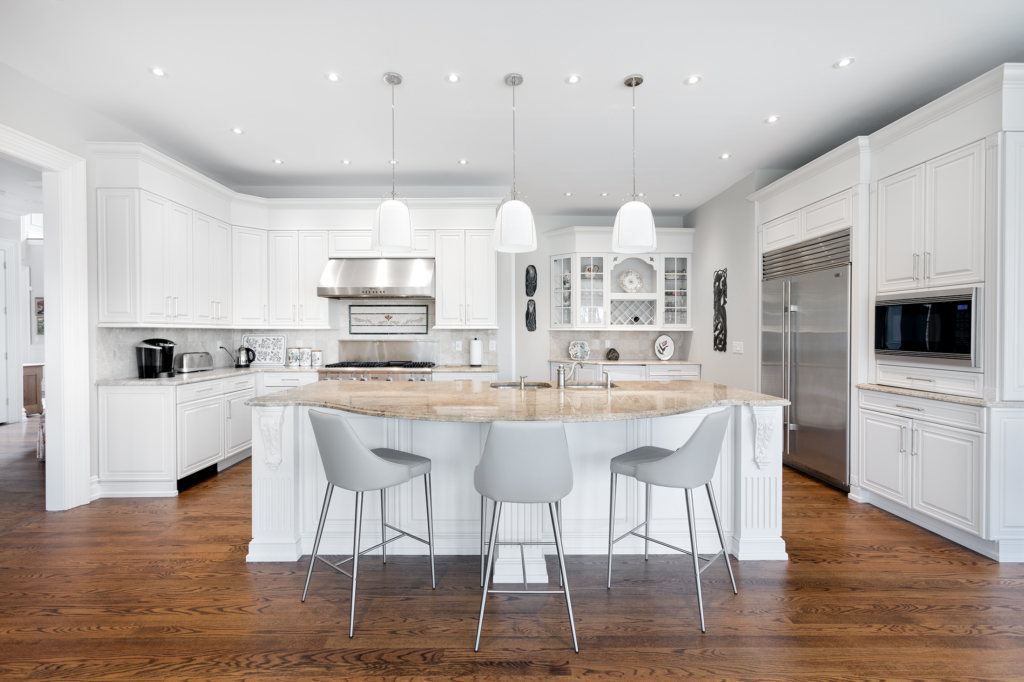
Whatever mood you desire to create — crisp, comfy, sleek, or retro — neutrals are “in,” and white is a versatile and popular choice. (Please enjoy our pics from recent Greenleaf projects!)

Shades of white provide a perfect setting for a kitchen space, accommodating all other colors and the full gamut of materials and textures.

Here are five style choices for integrating a white kitchen with accents and furnishing to create the just-right ambience you desire.

Clean and crisp: Make use of contrast with stainless steel or black appliances and accessories or glass surfaces. Add finishing touches with a  few brightly colored accents like chair covers, vases, sculpture, and vibrantly colored flowers.

Warm and comfy: Wood is your friend. Consider using dark or light wood flooring and furnishings (as above) plus wall accents like decorative wood utensils. White-on-white paper on one wall can add softness and interest, and a vase of pastel or warmly colored flowers can add a welcoming touch.

Modern and sleek: Integrate contemporary furnishings with architectural lighting (beautiful pendant lighting below!) Add finishing touches with abstract sculpture, art and photography.

Retro and relaxed: Past and present can be happy together with appliances and flooring patterns designed with an old-school look. White walls are the perfect canvas for black and white photos and old movie posters. Finishing touches can be discovered at antique shops and yard sales.

Eclectic: You might prefer a blend of styles … We paint a lot of historic homes (these cabinets, below, used to be cherry!) We often see wonderful blends of the old and new. Be creative — it’s your kitchen!

Whatever style you choose, add freshness and seasonal color with plants, flowers, and fruit bowls. Create interest with recessed lighting and unique or classic pendant lighting. Add pops of color with artwork, and decor. 

White walls blend well with a variety of back splashes and kitchen islands. Backsplashes popular with many designers include marble, hexagon patterns, nickel or mosaic tile, and brightly colored block patterns. Prep and serving kitchen islands come in several woods and colors with countertops that include granite, marble, quartz, wood or hybrids.

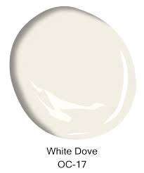
Some popular whites are Decorators White (above) and White Dove (top of page) from Benjamin Moore or Snowbound and Alabaster (below) from Sherwin-Williams.

White has been a go-to kitchen color throughout modern history and has become especially popular this season. It’s often the choice of both designers and homeowners who want a color that looks and feels fresh and blends well with countless elements.

Call us soon — Greenleaf is now scheduling for the outdoor season (continuing indoor work as usual, too!). And thank you for sharing our name with your friends and family. Your word of mouth and online reviews make a huge difference to a small company like ours!

Our latest news update: You can now watch our educational videos on YouTube. The latest is “Why We Go Green.” Get videos, more updates & pics on FacebookInstagram! These include our crew and leadership highlights, fairs we attend & other news. “Stop over” on one of these platforms and say hi!

Three Ways to Make Your Home an Oasis of Color

The 2019 Colors Trends Say “Relax”!

Color can affect your mood, and how you use color in your home can shape how cozy your living space feels. Use these tips for lassoing the colors that please you to create a cozier, happier home.

The colors for 2019 are relaxing shades of lilac, rose, peach, leafy green and daisy yellow. Do any of those colors call to you? Here are tips for how to easily play with these or other colors you love:

Tip #1: Go for pleasing accents

Switch out your throw pillows, stack a few indoor gardening books. A sheep skin, pastel throw or lightly-patterned area rug can give a room a new, soothing look.

Nature is associated with relaxation. Bring some of it indoors with you! We always love coming home with a small potted flower from the local greenhouse. Avoiding pollen? A set of empty vases can work wonders with color.

Tip #2: What colors make you feel happy?

Identify your personal favorite “happy colors” and splash them around using tip #1. This round-up of suggestions is gathered from Southern Living Magazine:

Blue and green are associated with peaceful feelings. Lighter shades of blue and pastel greens are trending — they are especially nice for offices, libraries or bedrooms.

Orange. This warm and energizing color is great for entry ways, accent walls, a child’s room or kitchens. Why not try a softer shade that leans toward peach?

Yellow is often thought of as a sunny color — for obvious reasons — bringing optimism. This energetic color is also great for kitchens or a child’s room.

White makes small rooms look more open. It’s a clean-feeling color, and white kitchens are very “in” right now. If white is too stark for you, try a light shade of gray or cream.

Kitchen cabinets painted white

Tip #3: Trends come and go, so make it your own
Play with color and have fun! Ask a friend whose home you admire to come and “play” with you!If you need design assistance, we recommend these designers who we have had the pleasure of working with over the years: Linda Principe Interiors, Linda Madani Interiors and Ellen Maranca, of EZM Interiors.

And finally, if you want to re-paint some room colors, or do a full interior, this is the time to get on our schedule! We paint through the holiday season and all year round. We’d love to come and talk color with you.


The Color Column: Go with the Flow as You Choose Interior Paint

Ideally, choosing interior paint color is a fun, expressive project. However, we realize from working with customers that it can also be daunting. Here are some quick guidelines for choosing room colors, whether it’s for a bathroom or an entire house.

Main Rooms Flow Together

For main rooms, the name of the game is keeping everything consistent. Many homes have an open floor plan where rooms flow into one another, and halls can easily be viewed from the central living area. If this is the case for your house, colors need to be carefully matched so they don’t clash.

What many design specialists and painters recommend is to keep colors consistent throughout one level of your home so that walking from one room to the next maintains a feeling of flow.

“Color continuity is one of the most important concepts in interior painting,” Greenleaf Painters owner Jonathan Shenk said. “We recommend that dramatic differences in color be saved for an accent wall or for rooms that are separated by doors.”

Use Bold Colors Playfully but Sparingly

Bold, trending colors such as brighter blues and greens can seem exciting at first, but your eye may tire of them eventually. Thus, we recommend that you use them sparingly — but playfully.

Unlike main rooms, bedrooms and other closed rooms can be great places for experimentation. The risk of using a bold color here has a much higher chance of paying off than in the whole house.

“We see more people take color risks in bathrooms or bedrooms than in large living areas,” Shenk said, whose home office is a slate blue color. “People really like bold colors in a closed room. It allows them to express their personality without risking painting large areas with this color.”

Express Yourself

“What colors are you drawn to?’ It’s one of the questions we ask when helping homeowners choose. Earthy, soothing colors are “in” right now. If you are looking for more of a flow in your house, this might be the year to create it with color

Tools to Use

Getting a color wheel, and placing colors side-by-side in a room can help you get a sense of whether two colors are compatible — or if they have conflicting tones.

Getting paint samples from a store and painting colors side-by-side on a board can also be helpful in testing your ideas.

Keep in mind: lighting and shadow can affect the hues.

Color visualizers online can be helpful in getting a general sense of color, but digital colors aren’t 100% realistic. If you start with a visualizer, be sure to check the color by using a color wheel or by painting a swatch.

What’s Next? Find us on Facebook for more color ideas and news!

Colors that will sell your home (or make you want to stay)

***
Color can make a difference for a buyer who is “on the fence.” We excerpted (below) a great magazine article about this.
Even if you’re not selling in the near future, here are some trending color choices for you to consider:
The Power of Color
Sue Wadden, director of color marketing at Sherwin-Williams, is intimately aware of the power of color.
 
Wadden says the definition of neutral is changing, and “drawing inspiration from the earth and sky with deep, rich tones like putty, clay, shell, sun and water. Bright golds are optimistic, yet the shift in beige moves away from warmer, yellow-based tones to brown-based grays.  These natural influences feel fresh and modern, while remaining neutral and functional throughout the seasons.”
Jessamy Tsoris, a Milwaukee-based color consultant and owner of Color Zen, equates dressing a home for sale much like you would prepare for an important job interview. “You should always wear a color that’s powerful, flattering, and typically classic,” Tsoris said.
“For your home, it’s less about selecting the neutral everyone is blogging about and more about what truly complements the home’s unique lighting and surfaces, especially wood tones. Generally, light, bright and airy neutrals leaning gray and/or coastal are popular at the moment. You want the home to look as modern as possible.”


“White trim–that’s a big one,” she said.  “Many people are painting unfavorable wood and ceilings white.  It’s instant happiness.  Other colors that are popular–shades of blue, from powder to green/blue/gray to navy.  Taupe as well.  Taupe weaves through all of the grays and I think we will see it a lot in the next several years in a very soft, organic way.
To get more great insights about color — click below:

InPaint Color Article with Highlights

Used with permission from Inpaintmag.com.

DIY Staging Your Home for the Spring Market

accent wall 6

***

Make Your House a Realtor’s Dream By Following These Low-Cost DIY Tips!

First impressions are everything when it comes to selling your home. Do these minor repairs and improvements and make a world of difference!

1.  Paint your front door and trim for a great first impression. An accent color can make a big splash!
2.  Paint one accent wall in a room that needs some personality.
3.  Caulk and grout your bathroom where needed.
4.  Replace any rusted or worn light fixtures or fans.

5.  Upgrade light switch plates, doorknobs or other hardware that shows wear.

Green tip: re-using is recycling! Donate your household items. The Vietnam Veterans of American offer curb-side pick-up. Call 1-800-775-VETS or visit scheduleapickup.com

* * *

Add space and beauty simply by following these three rules:spring flowers 2
1.  Declutter by putting mail in an attractive basket. Minimize your knick-nacks.
2.  Put a tall vase of flowers on the kitchen table. Height creates a feeling of elevation. Yellow is a luminous spring color and is associated with happiness and optimism!
3.  Lighten a dark room with a neutral or light-tint paint. Add personality and splashes of bright color using a fun set of pillows, vases of flowers, or a new accent rug.

Spicing Up a Room with Cultural Flavor 

Interior designer Monique Duarte, owner of Duarte Decor, shares her ideas about design and how she works with clients to spice up a room based on their cultural background and tastes.

Tell us aboutDuarte how you integrate a home-owner’s background with interior design?

I start with preferences, then take into consideration an individual’s cultural influences. I like to push the envelope sometimes. A client might like green and not have a preference on hue, but I may give them three different hues to choose from to get a better sense of their style and how adventurous we can go. I do think color adds so much character to a space.

Even if you just paint, it makes a whole world of difference. It can make a room look like a whole new room. I do accent walls, and really push the envelope in those areas.

During the first consultation, I always like to tell them a little about myself, not only my experience in interior design but also my background. I studied abroad, in London, England for over four years and lived in Italy for about two years, working in international business and marketing. I like to share that with my clients because it influences how I work.

For example, I can relate with clients of West Indian culture, because from the age of 15, I was going to Trinidad and Tobago every year to visit family of West Indian culture. Also, having lived in Europe for many years, I was surrounded with people of all cultures from Italian, French, African, Asian, Indian, Russian, Latin and more.  So through life experiences I had an opportunity to learn about these cultures and what makes the people and their preferences in life so unique.  Through traveling and being exposed to different cultures, it has taught me how culture influences who we are. A lot of time it naturally comes out.

How do you put together a room when you have furnishings from different cultures or eras?

With interior design, there really are no rules. That is the art of design. You can mix themes. It’s taking the time to think through what is aesthetically pleasing to them and will also function well.

Some clients will say that they want an Indian feel throughout our home, because that is their culture. Or there may be a specific room, such as a children’s room, that is themed.

I have a current client who is Indian and wants that theme in their living areas, but their son loves soccer, and so his room will be reflective of that.

When you do design for a family who wants a certain cultural look, do you mix in modern colors—or do you stick with traditional colors?

We talk about what are the must-haves. What is the ultimate design look that they want.

What happens when you have two individuals from two completely different backgrounds? 

I do get that a lot. The husband loves contemporary design. The wife is more on the traditional side. Usually in that situation, I will sit down and give them some visuals, going through magazines and catalogues. There are certain aspects that they can actually come to a compromise on. They might like Provencal furniture with a French flavor.

New Jersey is very interesting because we are right near New York and Philadelphia and Delaware, all with unique pockets of clients and homes. It’s a diverse area. My experience in working with different types of clients, there’s a lot of Indian, and a mix of caucasian and Asian. We get a lot of clients from India, and want to infuse those characteristics into their interior design.

We also get Toms River area. And those are closer to the water, and want a coastal design. Those are always fun to designer, because my family’s from the Carribean, and I love the beach and the water.

Tell us about your background and how you got into design?

My mother is from Trinidad, which was an English colony. My great-grandmother was Indian. My father is African-American, from Atlanta, Georgia. My mother has her own design company in quilting and fabric arts. She was and still is an amazing artist, having won many awards, and work shown in art galleries in Virginia. My grandmother by trade had a degree in interior design & all her life made porcelain dolls, jewelry, and clothes for a living. So I naturally come from a creative family.

However, It took me longer to realize that I had a creative calling for my work in life. When I bought my first home, I was working in advertising, and decorating the house became my little baby and stress reliever. It had all white walls, and I took my time and designed it the way I wanted my home to be. I got so much joy out of doing it, and when I finally finished it, friends would come over and ask if I hired an interior designer. That’s when I knew I had a knack for this. I then went back to school to study Interior Decorating at Penn Foster University. And then I went full-force and started my business in 2012, at age 30. I’m serving mainly Central New Jersey, and I’ve been venturing out into boroughs of New York as well. In 2015, we will be launching our expansion into the Caribbean and Latin Market (Dominican Republic), focusing on coastal interior decorating, which I am super excited about. I’m looking forward to expanding into those markets.

What is a favorite project that you have done?

I worked on a project last year, and it was a challenging but rewarding project. I was working with a single professional woman, who lived alone and spent a lot of time at work. When she came home, she didn’t have a lot of organization. A lack of good systems in place to keep track of things. Things would pile up. She wanted design, but also organization.

I brought in an organizing team first, before doing any design. We helped her create systems for organizing and even helped her purge old items that she no longer needed. And then, completely redesigned the home.

She said she was so grateful that her home was transformed. It’s peaceful and conducive to her life. We did more than just design her home, it helped transform her life.

A part of design is making sure the things in your space are the things that belong there. From a functional standpoint and also aesthetically.

Sometimes people don’t realize clutter has an impact on your emotions and mindset. We trained her to put mail into a specific place, a consul by the doorway, with a basket for her mail.

And now she can use her dining room table, which she can now use for dining with her friends and family. Design changes how you can use your home.

In this project, the client’s cultural preference was more based on her behaviors and being very close to her family. She always had her aunts, nieces and mom visiting her home, because family time was very important to her. So to ensure that the design of her home was in-line with this cultural characteristic, we made sure that all the design elements we proposed kept in mind that she would have family over often.  We incorporated a sofa bed into the living room, as well as a nice, plush reading chair in her guest bedroom for when her mother comes to visit. So, cultural characteristics can be infused in many different ways. It’s all about getting to know your clients and delivering on their specific needs and wants, something in-line with who they truly are.

And when you can make that kind of difference, it’s very rewarding.

Have you always combined organizing and design?

We didn’t initially offer organizing. But we saw that sometimes it was difficult designing a home without organizing first. The home has to be functional. The company we use is Honeybee Organizing. All of my clients who have done this organizing piece first have been 100% satisfied.

For ideas and inspiration, visit Monique’s website, http://www.duartedecor.com
Three Ways to Freshen Up Your Décor with Color

bedroom with fresh paint
freshly-painted bedroom with overhead lighting

With Interior Designer Linda Principe, of Linda Principe Interiors, LLC

Do you want to freshen up your decor? Rearrange furniture, paint, add new pillows? We spoke with Princeton-area designer Linda Principe, of Linda Principe Interiors, to get her best ideas of how to create a new look and feel for the seasons ahead, using popular colors and traditional design methods.

“The first thing I recommend is a fresh coat of paint in a brighter tone,” Linda says. “This refreshes and cleans up the look.” She said this is particularly important in the kitchen, where people spend so much of their time.

“Right now I’m finding the yellow tones and green to be popular.” She recommends Yellow Calla Lily or Summer Harvest from the Benjamin Moore color palette. These are yellows in the lemon/daffodil family.  She also is seeing more greens, such as Benjamin Moore’s Veranda View and Cucumber.

“The idea of these colors is to bring nature into the kitchen and give that natural look,” Linda says.

We tend to want to change up the rooms we spend the most time in. In her work as a designer, Linda has found that people tend to want to repaint their kitchen every few years to freshen up the look.

For the dining room, Linda suggests a dark color for a more dramatic look. How about Benjamin Moore’s Spanish Red, or Baked Cumin, which is a deep golden brown.

Another way to add color is to purchase some new throw pillows, or add a brightly colored vase and bring fresh flowers into the room. “It depends on what you have in the room, but you could consider a tangerine color or orchid (which is a vivid purple). Radiant Orchid is the 2014 pantone color of the year.”

Finding the right accent colors: Linda recommends looking at your accessories –the artwork & picture frames, the mats around the artwork, your area rugs. “A simple design strategy is to pick up colors from those items to bring those colors into the room. It’s a way of accessorizing color.”  One project that Linda recently completed was accessorizing using a green from the client’s foyer area rug.  She added green decorative boxes and a topiary to the entrance table and you could see how the elements tied together.

Next, lighting. Linda recommends having several sources of lighting in a room. The first source is overhead lighting, such as recessed lighting. The second is task lighting, which is a table lamp or floor lamp near a reading chair. A third is accent lighting, which provides elegance to a room. Linda suggests that accent lighting can provide the most appeal in a room. It can be used to focus on a piece of artwork, or create interest with sconces.

“Accent lighting gives you a softened appeal, especially in a dining room. When you use dimmer switches for overhead and accent lighting, it creates both elegance and a softer feel,” Linda notes. In a dining room with dramatic color, the lighting only intensifies the look and can create a dramatic effect.

Because Greenleaf Painters is a green painting company, we asked Linda about her thoughts on green interior design.

“I find a lot of people have asthma and allergies, and they have challenges with dust,” she says. “So I talk with them about removing carpeting and changing to hardwood floors. And of course most people today are interested in low-VOC paint.”

She observed that people seem to be more interested in keeping the furniture they have and making changes by painting or re-staining the pieces. “Rearranging creates a whole new look. Painting furniture or changing knobs can freshen up and keep costs down at the same time. These are all eco-friendly methods of creating that design element you want.”

For more tips on design, you may want to visit Linda’s blog at LPInteriors.com.